Cropping Exercise
Design Basic Index p.193
I cropped each of the various images below in order to change the focal point of the picture. I wanted the audience to see what was in the picture from a different perspective. By focusing in on details and smaller parts of the picture, you are able to see the image in a new light. To see the bigger picture of the original image, feel free to click on the links located on each of the cropped photos' captions.
 |
| Original Image : https://static.pexels.com/photos/36187/pexels-photo.jpg |
In this cropped pineapple photo, you can see that the crown of the pineapple is showcased. I wanted to showcase the "crown" because it has varying textures that go beyond the typical prickle of its popular yellow body. I also wanted to focus on the crown because not many will take the time to look at it as they simply cut off and discard that part before eating the highly popular fruit. It's beautiful too!
 |
| Original Image: https://static.pexels.com/photos/202581/pexels-photo-202581.jpe |
In this cropped photo of the bicycle, you will notice that it is only a very small part of the bigger picture. When I first saw this photo, my eye immediately was drawn to the golden bicycle and not the restaurant/bar that it was showcasing. This was why I decided to make my focal point of the picture the bicycle, and really try to see it in more detail.
 |
| Original Image: https://static.pexels.com/photos/147429/pexels-photo-147429.jpeg |
After viewing the entire photo, I noticed that there were many interesting elements to the picture. One of the things that my eye shifted to as I was scanning the photo, was the windows and how they looked old yet classic/sophisticated. When I zoomed in, that is also where I noticed the metal detailing as well as the tile design. By making the window the focal point of the photo, the viewer can really appreciate the design of it.
 |
| Original Image: https://static.pexels.com/photos/36226/pexels-photo.jpg |
 |
| Original Image: https://static.pexels.com/photos/56877/padlocks-completed-castles-love-56877.jpeg |
 |
| Original Image: https://static.pexels.com/photos/110055/pexels-photo-110055.jpeg |
In this last photo of the man, I wanted to shift the focal point from the center mural and make the audience wonder about the mysterious person. Why is he looking through his bag? What could be in it? What does he even look like? It's now a picture full of questions and it is not as straightforward as it could've been perceived previously. The message being communicated is now a little unclear and would need more analysis to come to a conclusion.
----
Color Echo Exercise
Design Basic Index p.219


 I thought this exercise was kind of fun and interesting.
I used Adobe Photoshop to complete these color echo fliers and surprisingly it didn't take me as long to learn as Inkscape (Vector software from last week). What I was also surprised of is that not all colors look good together, even if they are in the focal point of the picture together. It took me a little bit to play around with the different color layers and see what could go in the background and what could be for the font. This exercise taught me that even though you use the same/similar colors throughout different graphics, it can still create many various (but complementary) unique products.
*Note: The white borders around the pictures are not not supposed to be there, it is just there because of my blog theme.
----
Border Variation Exercise
Design Basic Index p. 197
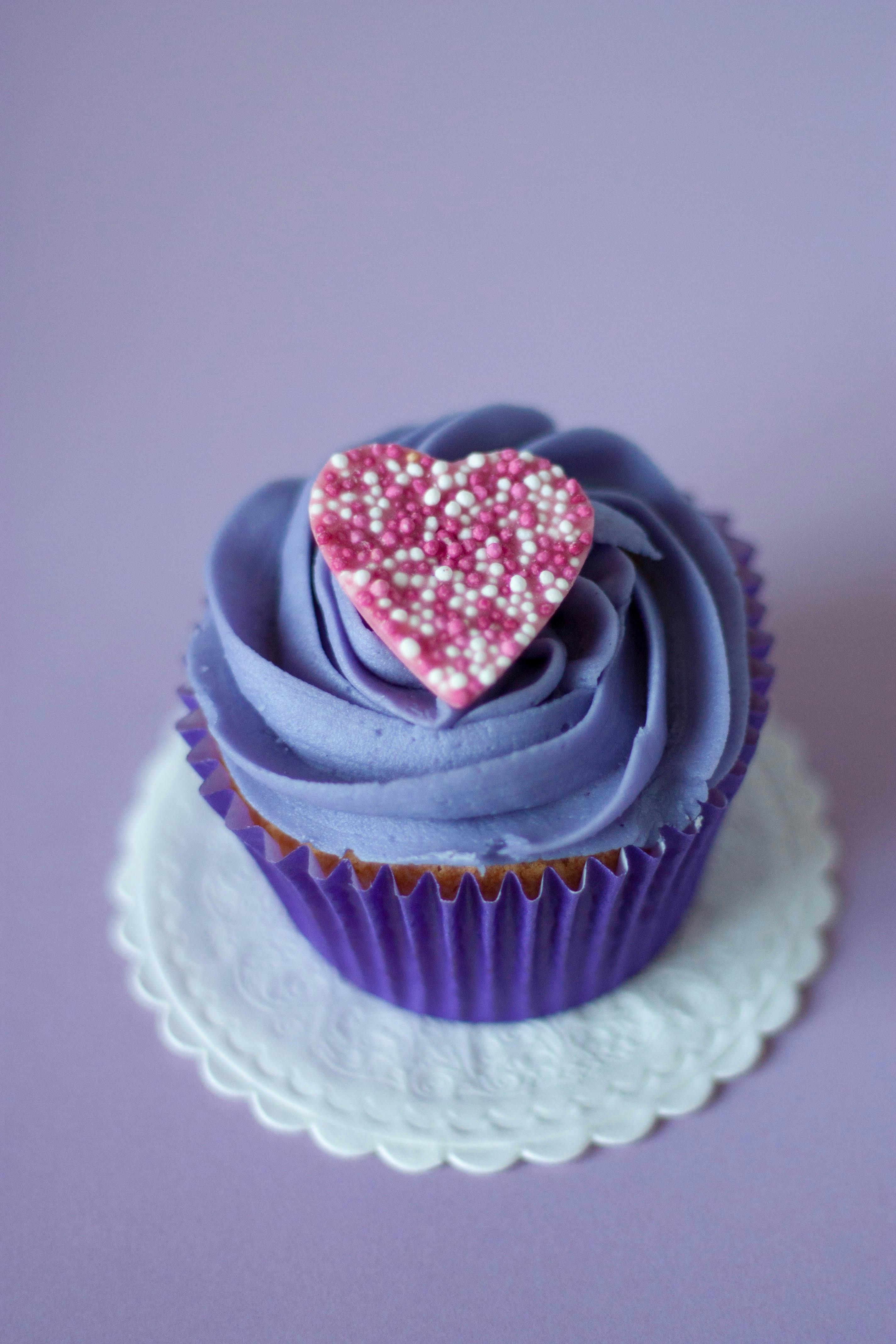
Original Image: https://static.pexels.com/photos/8882/love-heart-purple-dessert.jpg

To complete this exercise I used Canva to find borders that will enhance the image of the cupcake. I played on the cupcake's swirled icing, heart shaped decoration and its' general shape to find corresponding frames. I also incorporated colors from the cupcake into two of the borders (color echo) to try to enhance the image. This activity taught me that something so simple (border) can make a big difference in how a viewer sees the image. It is yet another component that I've learned and I find it so interesting to see that just by tweaking the "little details" it can make a big difference.
Design Basic Index p. 197
Original Image: https://static.pexels.com/photos/8882/love-heart-purple-dessert.jpg

To complete this exercise I used Canva to find borders that will enhance the image of the cupcake. I played on the cupcake's swirled icing, heart shaped decoration and its' general shape to find corresponding frames. I also incorporated colors from the cupcake into two of the borders (color echo) to try to enhance the image. This activity taught me that something so simple (border) can make a big difference in how a viewer sees the image. It is yet another component that I've learned and I find it so interesting to see that just by tweaking the "little details" it can make a big difference.
Hi Elaina,
ReplyDeleteI really like your color echo images! Your choices added some great highlights to the cookies, and made them stand out. All of your photo crops completely changed the original photographs. Hard to believe some were in the images you cropped, like the pineapple and the man bent over the backpack. Those two created different thoughts and ideas around the focus, compared to what the original photos looked like. I like that your borders maintained the color echo of the cupcake frosting. Using the vector shapes was simple, yet effective!
Hi Elaina,
ReplyDeleteThis was such a fun post to enjoy! I love your use of Canva to play around with the borders in the cupcake images. I also appreciate your reflection on ways in which changing small details such as a border or a crop can truly change the visual experience. I have found that since I began this course, my visual experience of the world has changed on so many levels.
I can't seem to look at an advertisement or even a classroom handout without considering the design elements involved. I have recently begun to consider the ways in which educators, as guides for communication and interaction, truly need to be trained on the nuances of interpreting and creating visual information. Prior to this course I thought I was a generally well-educated producer and consumer, especially when it comes to life in the classroom. I now consider so many more elements as I interact with children on a daily basis. I am also considering the ways in which these small details can be reflected in the classroom environment. There are many details I will be rethinking for next year!
Thanks for sharing your work...I appreciate how time consuming all of the small details can be as we work through the mini art school exercises!
Hi Elaina,
ReplyDeleteWOW! I love your mini art school this week! When clicking on your post I was amazed by all the different pictures and designs I saw. From the start I really liked how you decided in the cropping activity to hone in on a interesting aspect of the pineapple. I think this part of the cropping activity is important because it is important to bring the viewers attention to an aspect of the image that typically goes unnoticed. I think you did an excellent job with all the photos with that. Also I think the color-echoing activity was very eye-opening and I could tell right when looking at it that you had fun while doing this activity my favorite flier out of all of the ones you created was the bottom one. I really liked how the macaron did not look the same from the other two fliers and you decided to add different variations of color throughout the image which I think really helps with accenting everything this flier is presenting. Last but not least I think the border variation activity was a nice one too because I thought the borders were very subtle and not too drastic. The designs really help to target the cupcake in this part of the project. Overall, I really liked seeing everything on your mini art school this week and can't wait to see what you design for next week! Great JOB!
I found your design choices to be quite interesting in terms of what ended up working and what didn't work so well. I'll start with the more critical review: I don't like how the color echo turned out. I think you did a good job on varying the setup and what colors you use, but I think your choice of original subject really worked against you here. Do you remember the color chapter of White Space? In that chapter they talk a lot about various color combinations that do and don't work so well. Christmas, jeans, and royalty, though they also talk about a number of other variations that you can get away with. These macarons however are just too busy color-wise. The original image is an equal mix of five very distinct colors and it's very hard to tie those together.
ReplyDeleteOn the other hand, I loved how your border variation exercise came out. In particular the upper two and lower left borders are remeniscent of napkins and dollies which are what you might very well find a cupcake actually served on. The mid left makes me think 'picture frame' which is kind of odd to see a cupcake in and the heart border unfortunately clipped off part of the image which I think didn't work out so well. I think my favorite is definitely the upper left because of the stitching which just adds this extra level of detail to it making it seem kind of fancy. On a side note, I think that this photo would have worked a lot better for your color echo as well since it was much more color coordinated than the macarons.
This comment has been removed by the author.
ReplyDeleteHi Elaina,
ReplyDeleteGreat post! I absolutely love macarons exercise. The stripe of color looks great against the monochromatic stack of macarons. It definitely stands out and makes you want to notice it. It is full of bright colors which should also keep reachers' attention. Your cropped photos look great! I love the top of the pineapple photo. I also love how you framed the caption by using the word "crown" to describe the top of the pineapple. It is great that you chose to use "nontraditional" focal points in your cropped photos. I love how you completely changed the bike photo to where your eyes went first as the new focal point. It is such a cool picture with a completely different vibe than the original one.